Brand Identity + Subscriber Acquisition
16×9
24×7
24×7
The Filmmaker's Streaming Platform
Creator-First Economics — UK/US Launch
The streaming economy had consolidated around two realities: algorithmic scale and catalogue extraction. For the indie filmmaker, the maths had never worked — 30% revenue splits, zero audience ownership, and a recommendation engine optimised to bury anything without a $50M marketing budget behind it.
16x9x24x7 was built to break that contract. The challenge wasn't product — the creator economics were genuinely differentiated. The challenge was existential: how do you launch a streaming platform into a market where the incumbents have already defined what "streaming" means, and make people care enough to pay before the content library justifies it?
"Independent cinema has always thrived on scarcity and exclusivity — film festivals, single-city runs, word of mouth. We needed to build a streaming platform that felt like a film festival, not a cable package."
The early-adopter audience for 16x9x24x7 wasn't a passive viewer. They were the person who walked past the multiplex to find the arthouse three streets away. The person who followed directors, not titles. The person who believed that the best cinema of their lifetime was being made outside the studio system — and were angry they couldn't find it.
That anger was the brand asset. The brief became: turn justified grievance into identity. Make subscribing to 16x9x24x7 a statement about what you believe cinema should be.
The name is a compressed argument: 16:9 is the frame — the universal canvas of modern cinema. 24/7 is the access — the promise that filmmaker-owned cinema is always on, always there. Together they're a number that only means something if you already care. We leaned into that exclusivity.
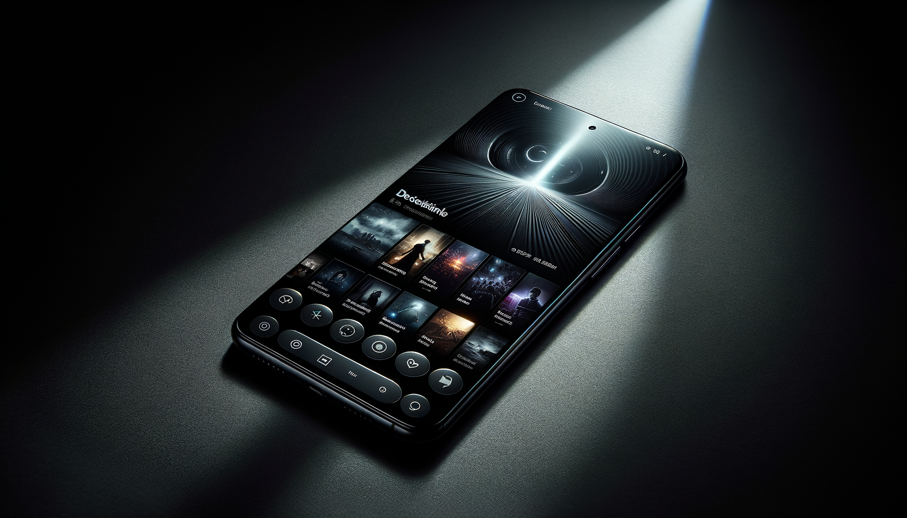
Brand identity was built around the literal geometry of the name. 16:9 becomes the logo lockup, the typographic grid, the UI layout principle. Deep charcoal backgrounds with amber highlights — the warmth of a cinema projector against the dark. No sans-serif friendliness, no rounded corners promising ease. This was a platform with opinions.
The app architecture reflected it: filmmaker-centric navigation ("My Cuts", "Directors"), production diaries alongside features, direct messaging between subscribers and filmmakers. The OOH campaign ran in film-community locations — the arthouse foyers, the editing suite districts, the film school corridors. The manifesto film — shot on 16mm, sound-designed like a trailer for the idea of cinema itself — became the acquisition anchor.
<\!-- Gallery -->
Brand identity system — logo lockup, typographic grid, and app UI built entirely from the 16:9 aspect ratio as a structural principle.
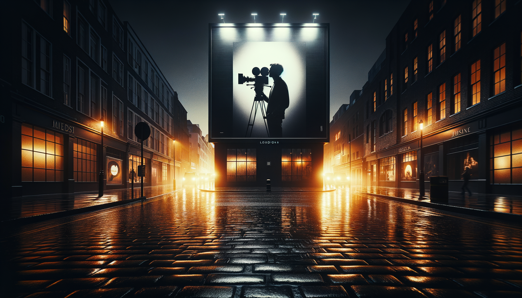
OOH campaign — arthouse cinema foyers, film school districts, and editing-suite postcodes in London and New York.

Subscriber acquisition social suite — Instagram, Twitter, and pre-roll. Manifesto film concept seeded through filmmaker community channels.
The platform design brief was inseparable from the brand brief. Creator-first economics had to be legible — not buried in a terms page, but visible in the interface. Every design decision was a statement about whose interests the platform served.
We'd been rejected by every major distributor. Prelude helped us build a brand so distinct that we stopped being a streaming service competing with Netflix and became something entirely different — a movement. The 28,000 early subscribers didn't subscribe to a platform. They joined a cause.
Prelude works for brands that take the work seriously. $35/week.
Start Your Overture →