Rebrand + Packaging System
Casa
Verde
Verde
Premium Sustainable Home
Eco Without Looking Eco — DTC-to-Retail Launch
Casa Verde's products were genuinely excellent — concentrated refillable cleaning liquids, compostable packaging, carbon-neutral manufacturing. The conviction was real. The problem was a visual identity that announced its credentials before the product could speak. Brown kraft paper. Green-heavy colour palette. A font that said "farmer's market" when the brand wanted to say "premium lifestyle."
The retail buyer brief was blunt: we love the product, but this doesn't belong on our shelves. The DTC audience was small and loyal, but the crossover opportunity — major UK supermarkets and US specialty retail — required a brand that could hold its own next to Method, Aesop's home range, and Mrs Meyer's. Without becoming any of them.
"The most credible eco brands don't shout about being eco. They let the product design speak — and design the product to be impossible to ignore. Casa Verde needed to stop performing its values and start embodying them."
The consumer shift was clear: sustainability-curious buyers had become sustainability-fluent. They didn't need to be educated. They needed to be seduced. The new Casa Verde had to be shelf-ready without shelf-compromise — a brand that a Waitrose buyer and a design-savvy DTC customer would both reach for, for different reasons.
We rebuilt the identity around restraint. New proprietary packaging: frosted glass bottles with hand-finished sage green labels, a botanical embossing system that replaces the need for print — each product line identified by a different plant genus pressed into the label surface. The refill pod system became a design element, not just a functional add-on.
The colour palette stripped to four: chalk white, deep forest, sage, and warm linen. Typography replaced the organic-market softness with a condensed editorial serif — designed to work at shelf scale and at thumbnail scale simultaneously. The outcome was a brand that looked expensive in a way that sustainable products rarely do.
<\!-- Gallery -->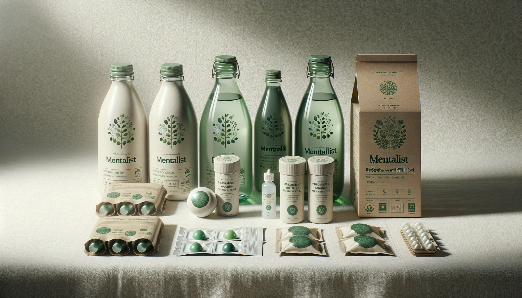
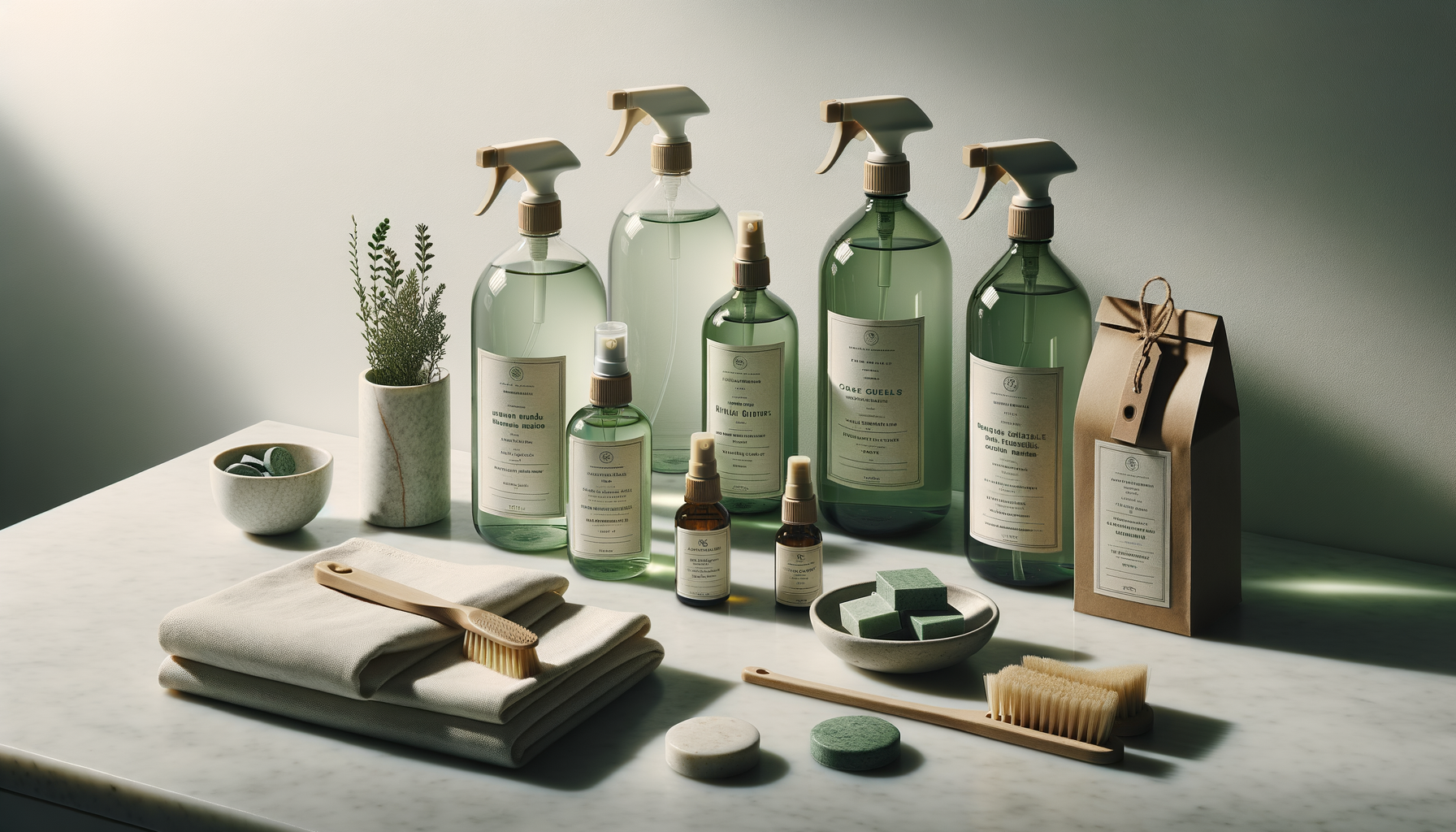
Full packaging system — glass bottles, refill pods, and secondary packaging. Photographed for retail buyer decks and DTC e-commerce.
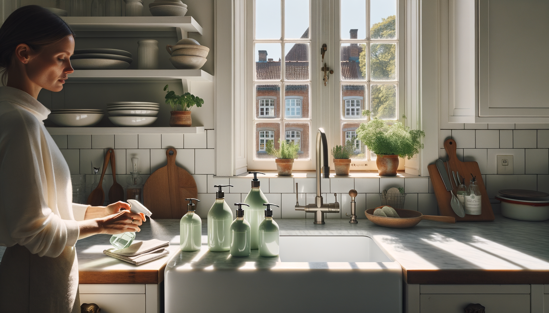
Lifestyle editorial photography — hero campaign imagery for launch. Placed across paid social, homepage hero, and press coverage.
Social ad formats and retail POS — the packaging system used as art direction across every touchpoint.
Every design decision was made with dual intent: shelf standout and structural sustainability. The result is a packaging system that's approved for supermarket ranging and certified by the Soil Association, simultaneously.
We'd spent three years apologising for being sustainable. Prelude helped us understand that apology was the problem. The new Casa Verde doesn't justify itself — it just looks right. The buyer response was unlike anything we'd seen.
Prelude works for brands that take the work seriously. $35/week.
Start Your Overture →