Rebrand
CLARO
The Honest Economy — Full Identity Overhaul
CLARO had grown to 400,000 users entirely on product merit — zero-fee transfers, instant settlement, genuinely clean UX. But retention was eroding. The churn data told a story: users weren't leaving because the product failed them. They were leaving because they'd lost faith in fintech as a category.
The brand didn't help. A generic blue wordmark, "simpler banking" copy that applied to every app in the App Store, and a visual identity that could have belonged to anyone. CLARO had earned trust with its product and then spent it all with its brand.
"Every fintech promises simplicity. CLARO's real differentiator wasn't what it simplified — it was what it refused to hide. The rebrand couldn't promise trust. It had to demonstrate it through radical transparency."
Users who churn from fintech apps aren't looking for better features. They're looking for a brand they can read. CLARO's data showed that users who understood exactly how the product worked — fee structure, data policy, settlement mechanics — churned at 23% the rate of those who didn't. The insight was already in the numbers.
The rebrand stripped everything that wasn't load-bearing. No smiling people in coffee shops. No abstract "simplicity" metaphors. Just numbers, data, and typography that had the confidence to stand on its own.
The new CLARO identity leaned into financial precision as a visual language — clean grids, monospaced elements, the exact font weights used in financial reporting. The card redesign became the product's most powerful piece of creative: dark, architectural, and unmistakably CLARO.
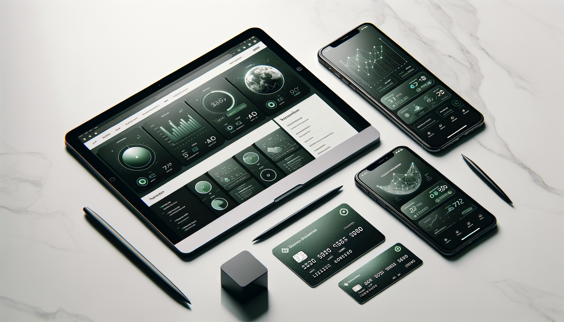
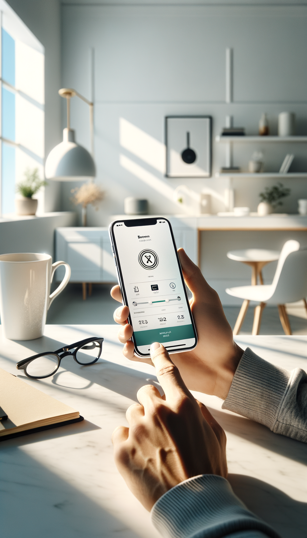
App redesign — new information architecture prioritising data transparency. Balance, card, transactions above the fold with no marketing clutter.

Facebook / Instagram acquisition creative — data-led copy, zero lifestyle imagery. Performance-tested across 8 headline variants.
Refreshed brand identity — Midnight / Cobalt / Off-White palette. Space Grotesk as primary typeface, chosen for its financial precision and warmth.
We thought we had a product problem. Turns out we had a brand problem. Prelude gave us a creative system that finally matched what the product was actually doing — and the numbers followed immediately.
Prelude works for brands that take the work seriously. $35/week.
Start Your Overture →